01 The complaint
Too expensive, said everyone who skipped the details
This was the first challenge waiting for me when I joined the startup. Complaints about the rent were growing, and earlier research had already found the likely culprit: people weren't seeing the whole package. Energy, internet, maintenance and other bills were part of the price, but the page didn't make that obvious.
So the job wasn't to make the rent cheaper. It was to make it understood.
02 What I noticed
Three easy fixes and one bonus
Looking at the page as it was, a few things stood out right away.
- 01Less scrolling
Rework the component that listed the benefits, so people didn't have to scroll forever to see them.
- 02Right next to the price
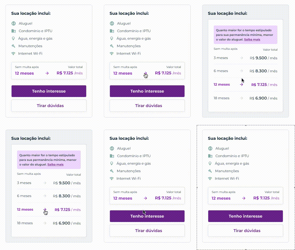
Show the full package in the floating card beside the price, so nobody mistakes it for optional extras.
- 03One icon per perk
Give each item its own little illustration, to catch the eye as people skim.
- +A bonus
Connect the minimum length of stay to the price, and show that staying longer can make it cheaper.
03 What we tried
Same apartment, better reading order
The old list was long and tall. On average, an apartment came with about 7.3 benefits, so I designed a compact grid that fits eight per row on desktop and four, plus a small carousel, on mobile. Included items and things you could add on top were finally shown separately.


The floating card next to the price had leftover space and only showed part of the list. I reorganised it around a simple reading order: first the benefits, then the length of stay, then the price. By the time you reach the number, you already know everything it pays for.
We also removed the "not included" items, those little crosses next to things you don't get. If it's not included, it's not included. That freed up room for a friendlier, illustrated list of what you do get.

Every contract runs for 30 months, but the minimum stay is flexible. Stay longer, pay less, and negotiate with a little more confidence.
That became the last step of the card: a price component tied directly to the minimum stay. It closes the reading journey on a nice note, and it gives renters something to work with before they even start the process.
04 Asking real people
Did anyone actually notice?
To check the hypothesis, I ran an unmoderated usability test on Maze. People landed on a prototype of a listing with a single, simple task: start the rental. Nothing about benefits, nothing about prices.

Once they finished, we asked an open question: what did they understand was included in the rent? No hints, no multiple choice.


05 How it ended
Ready for development
of the answers listed the benefits package without being asked to look for it. People were starting the rental already knowing what they'd get, which was exactly the point, so the improvement went to development.
The final version was adapted for every device, and it helps renters make a calmer, better-informed choice, especially when they compare Yuca with places where these benefits aren't part of the deal.